Ruhaya
Logo
Brand Design
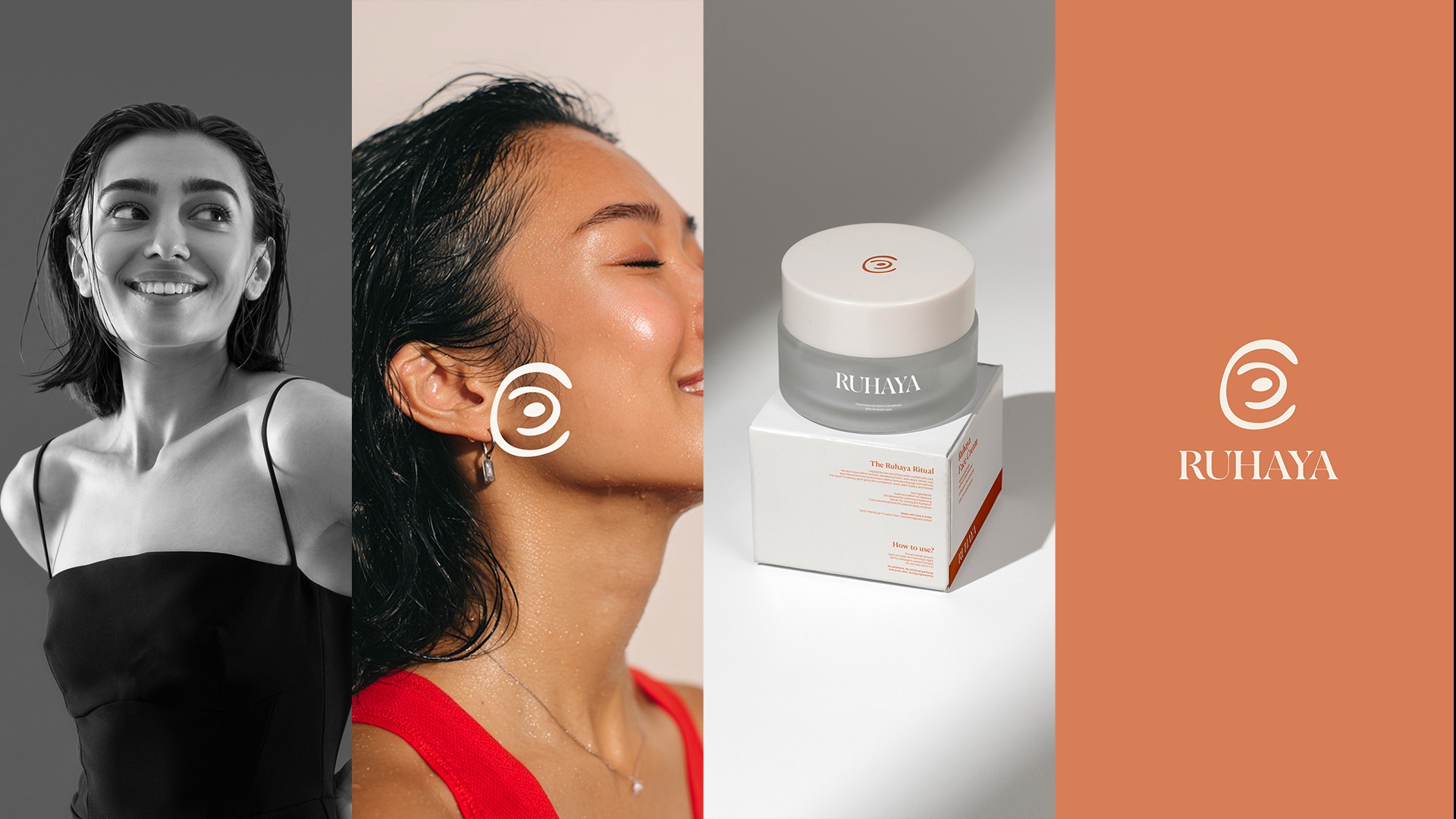
Designing a calm, minimal logo rooted in Ruhaya’s skincare philosophy, created to feel intentional, quiet, and timeless.

Their Brief & Our Approach
Ruhaya approached us with a clear philosophy skincare not as correction, but as a feeling. Rooted in softness, stillness, and the meaning of the word “ruh” (soul), the brand wanted an identity that felt quiet, grounded, and emotionally resonant rather than loud or trend-driven. The brief was to design a logo that could hold this depth while remaining minimal and timeless. Our approach focused on restraint and intention. We designed the logo to feel calm and spacious, allowing room to breathe rather than demand attention. Subtle forms, balanced proportions, and an earthy sensibility guided the design, ensuring the mark reflected Ruheya’s belief in simplicity, presence, and emotional connection. The logo became the foundation of the identity not as decoration, but as a quiet symbol that supports the brand’s philosophy and invites people to pause and feel.
Logo Design, Brand Design, Packaging
December 2024

(Project)
Next Project
(Contact)


